The best brands no one is talking about
When people talk about the best brands, the same names always tend to show up: Nike, Coca-Cola, Apple, Disney, Patagonia, Ikea. So let’s take a moment and give these massive mega brands a round of applause. They mostly do a great job and deserve the credit. At some point, though, people get tunnel vision on these brands and forget that there are lots of ways for brands to be iconic. So we’re out here looking for strong brands that fly under the radar—brands that have great identities, and have been at it for a long time without changing who they are.

Our five point criteria
Differentiated with a clear POV: Plenty of brands feel different relative to their competition, which is table stakes for a good brand. Fewer have a clear point of view on how the world works. Rarer still are brands that do both. Here, we’re looking for those rarities.
Iconic, recognizable: A lot of brands are forgettable. These are not. They stick with us for myriad reasons, starting with a solid product and crossing over into iconic status with tasteful brands that stand out (see above).
Not the category leader: If you’re the category leader, people are probably recognizing your brand by default. There’s nothing wrong with that but it’s important not to conflate success with having a good brand. We’re looking for brands that punch above their weight.
Haven’t changed much and better off for it: A lot of brands wind up chasing trends—making a steady stream of updates in an attempt to keep up with consumer tastes. In general this feels dilutive. We’re looking for brands who generally stick with what they’ve got because it has been working well and feels essential to who they are. We love quiet confidence.
Twenty plus years old: There are lots of cool new brands out there. Will they stand the test of time? Who knows. We’re borrowing the 20 year vintage standard and only looking at brands that have exhibited some staying power.

The best brands no one is talking about
Big League Chew
It’s gum, we swear! Big League Chew has some of the trappings of a bag of chewing tobacco paired with 1990s-style baseball cards. It doesn’t take itself too seriously and clearly stands out in the candy aisle. It’s hard to imagine this brand getting approved in today’s climate, so we’re glad it’s not only surviving but thriving thanks to a refresh by our friends over at Seedhouse.
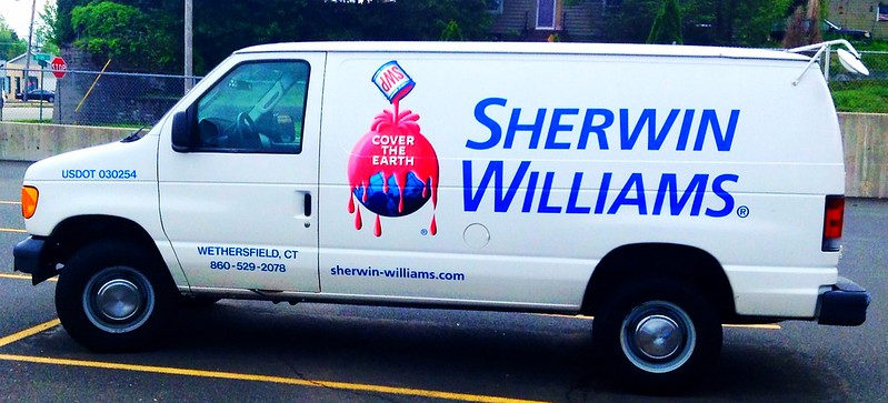
Sherwin Williams
“Cover the earth” is bold as hell. The logo is a cult classic in saturated red and blue. It’s literal in an absurdist way, and has stood the test of time.
Mesa Boogie
While plenty of great branding shows up in the world of guitar amplifiers, Mesa Boogie has the right blend of attitude and restraint. Some amps are simple, all black affairs with “Boogie” on the front in a tasty rounded serif—others are made of exotic hardwoods with cane wicker faces that scream “I know how to party.
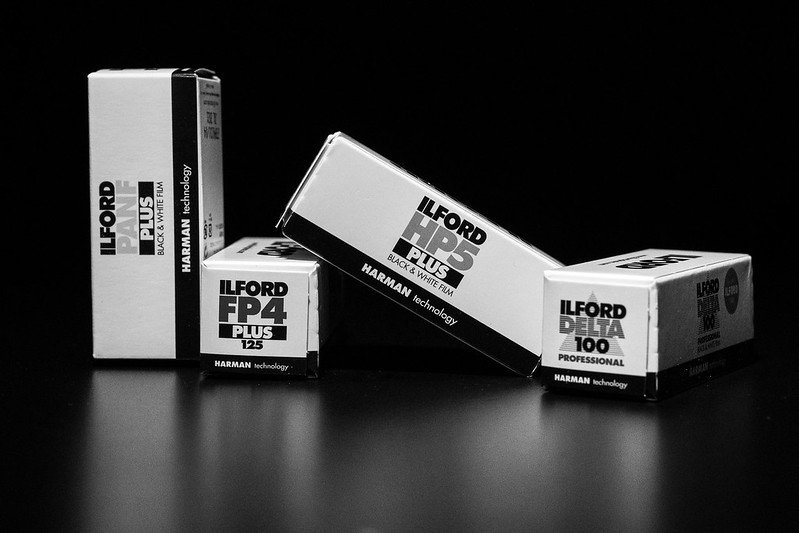
Ilford
While Ilford is English, their design feels more Swiss. They mostly make black and white so their selective use of color in packaging really pops. I can’t remember the last time they changed anything, and why would they
York
A candy aisle classic with great script, cool colors, and a square packet that stands out amidst busy surroundings. It’s also interesting how this York, and the one that makes air conditioners both traffic in “cool” yet “York” is just a surname and location.
Eveready
Sure, they don’t advertise like Duracell and Energizer, but the Eveready brand is much more interesting than their category leaders. They make great use of black, red, and silver. But the piece de resistance is their logo of a cat jumping through the number 9. What does this have to do with batteries? I guess they just don’t die.
Dr. Bronner’s
I’ve often tried to read Dr. Bronner’s soap bottles but I never get too far. It doesn’t matter because they are so different than any other soap company out there. They make great use of color and have a wide range of simple and great smelling products. I tried using it as toothpaste on a backpacking trip once and I regret it. But even with that gross experience, I think no less of their brand.
Bonne Maman
Storebought jams and preserves, for whatever reason, feel like they should be as close to homemade as possible and Bonne Maman nails that vibe. Simple, handwritten-esque type with a gingham lid and recognizable ingredients make all the other brands feel overly processed or hippie dippy. Yum.
Joy
While their logo isn’t quite the same as it used to be (the slight gradient is relatively new), Joy clearly understands the importance of simplicity and staying true to their old-school vibe. We’re talking about ice cream cones, the Keep It Simple Stupid (KISS) approach works in their favor.

Cambro
Cambro is a brand that lives in just about every professional kitchen in the US. Their products are instantly recognizable even though they have minimal (typically invisible) branding. The bright colored tops, graduated sides for measurement, and near infinite sizing make Cambro a kitchen staple.
Felco
As any gardner can attest, Felco is top tier gear. So is their brand, crowned with a tasty, simple logo and enough Swiss cleanliness throughout to keep everything tidy without being sterile.
Duck tape
It’s a right of passage to learn that it isn’t in fact called duck tape. It’s duct tape, for ducts. Along comes Duck tape, owning the mistake people make, and in turn, making everyone right. Bonus points for their cute lil duck mascot.
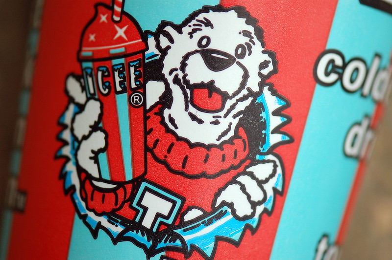
Icee
Red, white, and two tones of blue. Condensed type with snow on it. An anthropomorphized bear wearing a sweater. Icee says summer in a classic way that needs no introduction. You can almost feel the brain freeze.
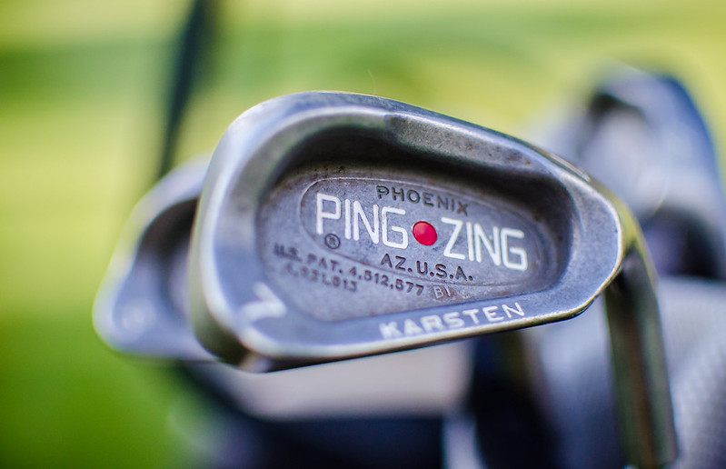
PING
While most golf companies use italics, swooshy lines, and comic mascots, ping stands out with interesting boxy-yet-round type and a weird line drawing of what looks like one of the spies from Spy vs Spy using a putter. It’s also great that their name is onomatopoeic in a way that feels really satisfying within the context of golf.
Brother
Printers suck. Brother doesn’t. Not only do they have a lovely logotype, the name is warm and the “by your side” tagline doubles down on that “we know printing can be annoying but we’re here to help, as best we can” sensibility. Thanks, bro.
Ben Davis
Right in the mix with Carhartt and Dickies, Ben Davis is a San Francisco classic that has more cool factor than the other big guys as they’re a smaller brand, have a great logo featuring a smiling ape, and some serious historical cache.

Vuarnet
French sunglasses made for mountaineering that have a cult following thanks to their mineral glass, iconic styling, and cameos in everything from the Big Lebowski to James Bond. The “V on a Ski” logo has stood the test of time.
Ricola
Riiiiiiiiiiiccccccoooooolllllaaaaaaaa! We usually think of these little flavor bombs when we’re not feeling our best, but when the brain fog clears it’s obvious they’re a well thought out brand with a really nicely designed logotype, colors, and packaging that makes us feel like we’re in a Swiss apothecary shop.

Ernie Ball
A guitar string pioneer, Ernie Ball built a great brand with the help of Roland “Rolly” Crump, a Disney Imagineer, who designed the logo, packaging design, and iconography—and Ernie let local kids decide on the eye-shattering packaging colors. The brand oozes early 1960s SoCal and the strings are top notch.
La Roche-Posay
It turns out, the formula for a good skincare brand is a 14th-century thermal spring and an aqua blue rectangle. Today, plenty of beauty and skincare brands take the minimalist—even clinical—approach that La Roche-Posay perfected in the 70s, to indicate that they’re more focused on what’s inside the bottle.
Colman’s of Norwich
An empty tin of Colman’s mustard powder is likely to get repurposed around the house for years to come. The iconic yellow label, practically unchanged since 1855, is the only quality assurance we need.
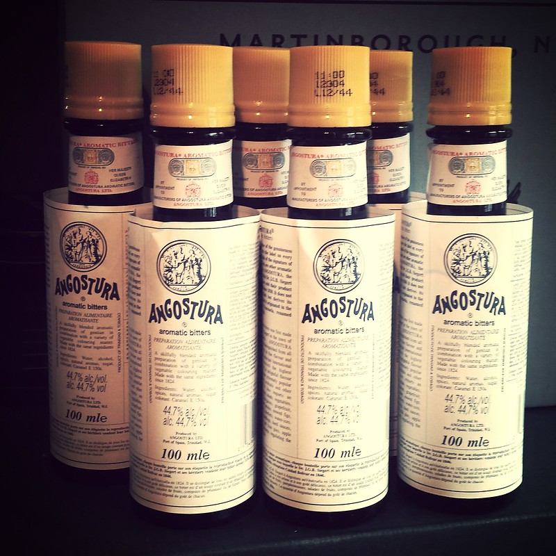
Angostura bitters
Like the role of bitters in a cocktail, this brand is a bit of an unsung hero in the busy world of spirits. The wordmark is somehow both nostalgic and timeless, and the oversized label (originally a mistake) is now unmistakable. Pretty wild origin story as well.